Version 1.2.0
Two colors carry the entire palette — black and gold.
This page is the live reference for how Immead looks and behaves — not a description of the system, an actual demonstration of it.
Black
Authority, sophistication, control. The default surface for everything — nothing competes with content.
Gold
Value, success, scarcity. Used sparingly as the only accent — every gold mark is a deliberate signal, never wallpaper.
This is the same logic as Amex Centurion / Rolex branding: an extremely restrained palette reads as more premium than a colorful one, because restraint itself signals confidence. Two hard rules have no exceptions anywhere on the site:
- Exactly one gold, used everywhere. No light/dark/deep variants. Every lighter or darker gold moment comes from transparency of the same one gold.
- Zero gradients, anywhere. Not on buttons, backgrounds, hover states, or cards. Every fill is a flat, single color.
Color System
Every value, copyable.
Click any hex, rgb, or hsl chip to copy it.
Brand Gold
The only accent color on the site — buttons, emphasis text, the accent section fill, borders and glows on interactive elements. Matches the wordmark exactly.
Brand Black
Page background everywhere. A hair off true black — reads less harsh on high-contrast displays while still registering as "black."
Brand Charcoal
A secondary near-black surface for small utility elements. Most "dark surface" needs are met by translucent glass instead.
Gold-on-gold Text
Text color wherever it sits directly on the gold fill — near-black with a warm undertone.
Inverted Dark Fill
A true opaque dark for elements that need to sit on the gold fill and still pop off it — translucent glass would vanish into the gold behind it.
The gold — history and rationale
The gold was tuned through many rounds before settling. It moved through a brighter metallic-gold reference, a warmer antique brass-gold, and a full round of amber-leaning candidates — each compared side by side across the header, hero, and gold-accent bands together. A muted antique tone was briefly mistaken for “the original” and restored, until the actual founding version of the mark turned up a brighter, more saturated golden-yellow underneath it. That first, truest gold — — is the one that stuck.
The mark and the site share one single gold value, pixel-identical. The logo is the brand’s gold reference — never a separately-tuned approximation of it. Any future gold adjustment changes both together.
Glassmorphism
Real panes of glass.
Translucent, blurred, with a light-catching edge — never a solid dark card, never gold-tinted.
Standard Glass
White at ~5–5.5% opacity, heavy blur with a saturation boost, a thin white border at ~16% opacity. 28px radius. Base content cards.
Premium Glass
White at ~6% opacity, same blur, a thin gold border at ~30% opacity. 32px radius. For the emphasis card on a page — the one that should read as the more important sibling.
Inverted Glass
Dark, near-black, low opacity. Same heavy blur. Used only when a glass card needs to sit on the gold fill instead of the black background.
- Background is always translucent white, never tinted gray or gold.
- Heavy blur with a saturation boost — keeps colorful content behind the glass vivid instead of washed out.
- A thin light-catching highlight along the top edge — sells “pane of glass” over “dark card.”
- Radius convention: 28–32px for card-level surfaces; smaller elements scale down, never up.
Typography
Three faces, one voice.
Free up what’s trapped in your business.
Clean, geometric-humanist, highly legible.
The default for all body copy and UI text — anything that isn’t a heading.
Work on the business, not in it.
Confident, modern, a touch technical.
Every heading on the page, applied as a blanket rule.
01 — 02 — 03
Technical, precise.
Reserved for numeric and technical accents only — never a default.
Hierarchy, together
Heading One
Heading Two
Heading Three
Body copy is always Inter, always white at full or reduced opacity — never gold. Gold is reserved for emphasis, not paragraphs. Headline sizes scale fluidly with viewport width rather than jumping between fixed sizes at breakpoints.
Section Patterns
The gold band.
Example accent band
A full-bleed flat gold section.
No gradient, no texture — used to break the monotony of an otherwise all-black, all-glass page. Never two of these back to back.
| On black | On gold | Why |
|---|---|---|
| Gold button | Dark button, gold text | A gold button on a gold band is invisible. |
| Light icon ring | Solid dark ring, gold icon | Needs to pop off the fill rather than blend into it. |
| Reduced-opacity white body text | Warm dark body text | White text on a light gold fill has no contrast. |
Tool Logo Wall
One gray card, every logo.
Every tile — icon mark or full-color brand image — sits on the same uniform mid-dark gray card, at the same uniform square size.




























































































Real Workflow Showcase
Unboxed. Floating.
No card, no border. The screenshot’s own edges fade into the black background instead of reading as a pasted rectangle.
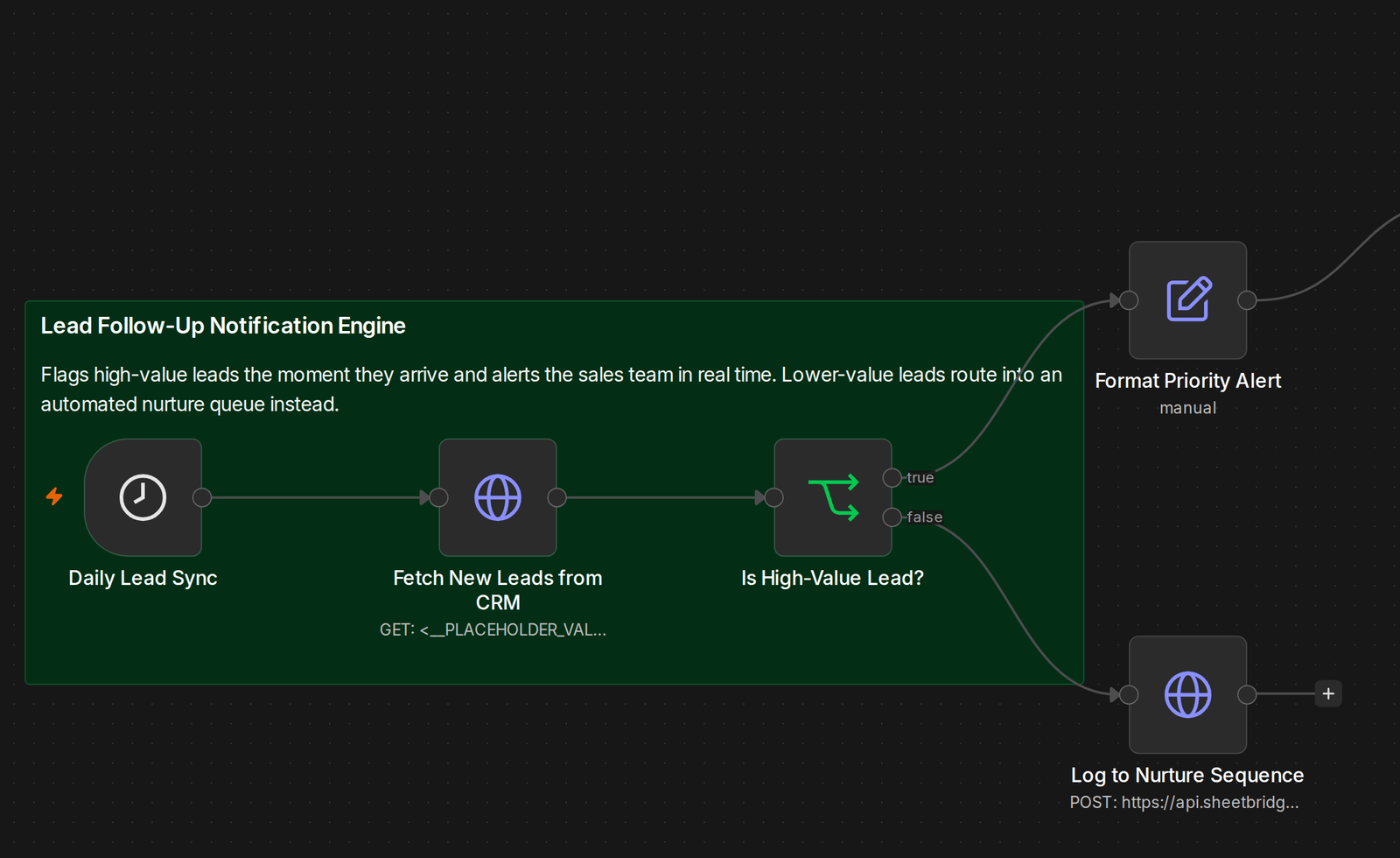
A real automation, pulled straight from a live client build
Animation
The one place motion means something.
Call
Free, confirms fit
Commit
Deposit, work begins
Map
Guided, day by day
Automate
Hands-on + AI, built
Live
Approved, shipped
Retainer
Fixed, refined, monthly
Standing Rules
Hard constraints. Still in force.
- 01Exactly one gold, used everywhere — no second gold, no gradient gold.
- 02Zero gradients anywhere on the site — flat fills only, no exceptions.
- 03Glass surfaces are always translucent white, never gray- or gold-tinted.
- 04Never stack two gold bands back to back.
- 05A gold band replaces a card’s "break the monotony" job — don’t use both in the same spot.
- 06Every element inside a gold band needs its inverted counterpart.
- 07Logo wall tiles: one uniform square footprint and one gray card background for every tile.
- 08Every logo renders in its real, current, authentic color treatment.
- 09No purely text/card section should run more than one or two sections without a visual break.
- 10One consistent icon set — no mixed icon families.
- 11The site’s gold matches the wordmark’s gold exactly — the logo is the reference.